Grammar Girl is one of my favorite web sites for grammar. It's run by a woman named Mignon Fogarty. She does a great job of responding to real grammar issues and coming up with responses to people's questions. She has a lot of articles, but she does some great podcasts as well.
Here's a great podcast on a common grammar issue, affect vs. effect. Ms. Fogarty does a nice job using a really simple illustration and pneumonic to get her point across. She includes a voicemail in the beginning of the podcast to identify the problem. The whole podcast is a manageable 5 minutes.
There's a defined goal here, a simple and clear message, all in a mangeable format.
Friday, June 15, 2012
Tuesday, June 12, 2012
Visualizations--Good and Bad
Images seem to be one of the ubiquitous aspects of the internet. A major website like SI.com will have hundreds of individual links. Take a minute and really look at the image below:
Source: Frugal dad
Some sites are not elegantly organized or barely use any images. Our school formerly used groupfusion as a webportal. We had pages that looked like the following:
Groupfusion was functional for our school. You could have announcements and files, links and calendar updates. But this wasn't much more than a glorified filing cabinet for resources. There was no real way of prioritizing information by date or importance. It was hard to group links and files together in a single folder. But there wasn't the kind of graphical interface that makes other webportals effective. The kids knew that when they were on Groupfusion, you were doing SCHOOL stuff. And not in a good way.
You've got box scores, you've got stories, blogs, front page articles, you have subscriptions, links to every major sport and other topics. You can go from this page to almost any piece of information in the sports world. One click. That's no accident.
We are now used to this kind of visual delivery for content. In the last few years, the internet has spawned the infographic. A long, visual representation of ideas with text. You have to scroll through these graphics just as you would a news articles, and they contain text. What's key here though is how carefully they use color and simple images to get their ideas across. Here's an interesting example:
Source: Frugal dad
Some sites are not elegantly organized or barely use any images. Our school formerly used groupfusion as a webportal. We had pages that looked like the following:
![]() |
| Groupfusion... Bleh... |
Thursday, May 31, 2012
How is a whale like a web-page?
Students like linear texts. Teachers like linear texts. There is a reason why textbooks have nice bold vocabulary words, questions for comprehension, headings, and all that jazz. It's possible to open a textbook, gather information, but not actually READ anything. The kids are comfortable with this; these texts allow them to get through lots of reading, do well on their AP Bio exam, etc.
But there's something to a text that is creative, non-linear, and different. When students read Moby-Dick for the first time, it's incredibly disorienting. Chapters spring from everywhere. They have to work to understand the connections between chapters, that, on the surface, appear so different. There is a lot of work, but the ultimate effect is masterpiece.
Such is the case with hypertext. Those that say that hypertext is a liability compared to linear text, that it puts increased cognitive demands on the learner, totally miss the point.
But there's something to a text that is creative, non-linear, and different. When students read Moby-Dick for the first time, it's incredibly disorienting. Chapters spring from everywhere. They have to work to understand the connections between chapters, that, on the surface, appear so different. There is a lot of work, but the ultimate effect is masterpiece.
Such is the case with hypertext. Those that say that hypertext is a liability compared to linear text, that it puts increased cognitive demands on the learner, totally miss the point.
Wednesday, May 30, 2012
Hypermedia
In 1996, D.H. Jonassen wrote a piece about the power and possible applications for Hypermedia in the classroom.
Now, hypermedia is basically mainstream. Students and teachers, along with almost everyone connected to the internet, uses the world wide web on a daily basis. We are used to having an incredible array of interconnected knowledge at our fingertips.
What has happened recently is for some companies, especially Google, to make these hypertext incredibly visually and information rich, and for them to resemble real life sights. I'd like to give a few examples of Google applications that our beautiful, content rich applications.
Google Earth is a wonderfully ambitious platform. It attempts to document the world as it actually is, both in 2 and 3 dimensions. It then superimposes information: building names, stores, streets, natural landmarks, on top of the image. Google Earth has even developed ways for students to create "tours" and move around the world. Students can create their own labels, or "nodes," of information, tagged at appropriate places. Even more recently, Google Earth has allowed users to create fictional or historical buildings and cities.
Part of what makes Google Earth such an effective and widely used example of hypermedia is that its mission and flexibility is so broad. It really attempts to map the entire earth. It then lets the user utilize that map and tag information that he or she deems appropriate. You can use the application for geography, literature, art, history, or science. Because it is so successful in creating an accurate representation of the world, using it is almost like not looking at a computer at all, but playing with reality.
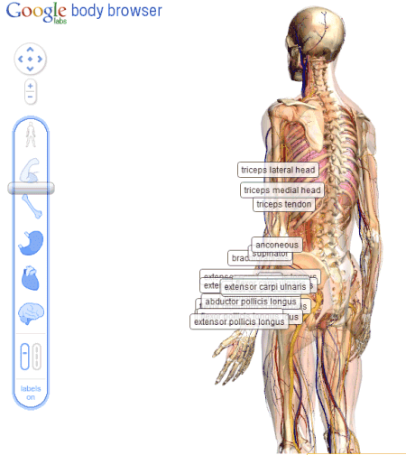
Google BodyBrowser is a take off of Google Earth, but with the human body. Science teachers used to have diagrams, skeletons, and textbooks in their class. Now the skeleton is the textbook. The student can look at skeletons, organs, different systems, or any combination. The resource is fully searchable.
Adding information to a realistic, but flexible image is one of the great attributes of Google Earth and BodyBrowser. Students can see how different organs and systems interact within the human body, but they can also explore, almost as if they are going into a cadaver, but anything they click on can bring more information to the screen. It would be a very powerful tool for biology students to go and explore, report back their findings, and then to discuss the disagreements or issues that students found. BodyBrowser is complete discovery, complete freedom of information within the human body.
There are other ways to give students a basic blank canvas, and ask them to create their own content and structure on top of it. Inspiration Maps is an example of a solid product that allows students to use Ipads and the like to create their own maps.
With Inspiration Maps one could create a pretty similar product to what Jonassen describes in the second half of his piece. However, it's important to note that this really is a blank canvas. The students have freedom to create their own "hyper" information system, but they would have to create everything themselves. I believe the power of Google Earth and Google BodyBrowser, is that they create a visual template for the students to explore and then add to them.
I'm not sure that in 1996 we could invision that a company would map out the entire Earth or human body. But now we have enormous resources for our kids to use and then augment to meet their learning needs and to show their understanding of a subject.
Now, hypermedia is basically mainstream. Students and teachers, along with almost everyone connected to the internet, uses the world wide web on a daily basis. We are used to having an incredible array of interconnected knowledge at our fingertips.
| The city of Dresden |
Google Earth is a wonderfully ambitious platform. It attempts to document the world as it actually is, both in 2 and 3 dimensions. It then superimposes information: building names, stores, streets, natural landmarks, on top of the image. Google Earth has even developed ways for students to create "tours" and move around the world. Students can create their own labels, or "nodes," of information, tagged at appropriate places. Even more recently, Google Earth has allowed users to create fictional or historical buildings and cities.
Part of what makes Google Earth such an effective and widely used example of hypermedia is that its mission and flexibility is so broad. It really attempts to map the entire earth. It then lets the user utilize that map and tag information that he or she deems appropriate. You can use the application for geography, literature, art, history, or science. Because it is so successful in creating an accurate representation of the world, using it is almost like not looking at a computer at all, but playing with reality.
![]() |
| Body Browser from Google |
Adding information to a realistic, but flexible image is one of the great attributes of Google Earth and BodyBrowser. Students can see how different organs and systems interact within the human body, but they can also explore, almost as if they are going into a cadaver, but anything they click on can bring more information to the screen. It would be a very powerful tool for biology students to go and explore, report back their findings, and then to discuss the disagreements or issues that students found. BodyBrowser is complete discovery, complete freedom of information within the human body.
There are other ways to give students a basic blank canvas, and ask them to create their own content and structure on top of it. Inspiration Maps is an example of a solid product that allows students to use Ipads and the like to create their own maps.
With Inspiration Maps one could create a pretty similar product to what Jonassen describes in the second half of his piece. However, it's important to note that this really is a blank canvas. The students have freedom to create their own "hyper" information system, but they would have to create everything themselves. I believe the power of Google Earth and Google BodyBrowser, is that they create a visual template for the students to explore and then add to them.
I'm not sure that in 1996 we could invision that a company would map out the entire Earth or human body. But now we have enormous resources for our kids to use and then augment to meet their learning needs and to show their understanding of a subject.
Sunday, May 20, 2012
Digital Natives--Digital Immigrants
Saying something new about Prensky's "Digital Natives Digital Immigrants" is now almost impossible. I'm not sure if I know of any piece of writing that has produced more discussion or agreement. Prensky spawned cliches and forced educators to take sides, to declare themselves.
So what does my digital passport read? I'm 27, so I was growing up when the promise of the personal computer was beginning to develop. I remember tying up my parents phone line on AOL, playing the earliest version of the Oregon Trail, and downloading programs to hack Instant Messenger. I was always more comfortable working with text on the screen, typing rather than writing. Organizing my thoughts, files, and life, always seemed easier on the computer.
Subscribe to:
Posts (Atom)